Health & Tech
The Power of Color: How What We See Affects What We Feel and Remember
Color doesn’t just change how we see — it shapes how we think, feel, and remember. From evoking emotions to enhancing memory, the neuroscience of color reveals its hidden influence on behavior, learning, and design. Understanding this power helps creators build digital experiences that truly connect.

Irena Jeftović Velkova
MD neurologist
Why Color Shapes the Way We Think and Feel
The world around us is bursting with color — from the deep blues of the sky to the rich greens of nature and the vibrant hues of digital screens. Many of us move through life without giving color much thought. But have you ever stopped to wonder: What exactly are colors? Where do they come from? Do they affect us more than we realize?
As it turns out, color isn't just a visual treat. It plays a powerful role in how we think, feel, and even remember.
How We See Color: More Than Meets the Eye
When you see something, your eyes register visual signals — including color. But it's your brain that processes and interprets these signals, allowing you to distinguish between colors and assign meaning to them.
The part of your brain responsible for this is called the visual cortex, located in the occipital lobe. Within the visual cortex, different regions are activated by different colors. These regions form a complex network that enables us not only to see colors but to understand them on an emotional and cognitive level.
The Neuroscience of Color: Emotions, Memory, and Mood
One of the most fascinating discoveries in neuroscience is how much color influences our emotions, behavior, and even mental performance.
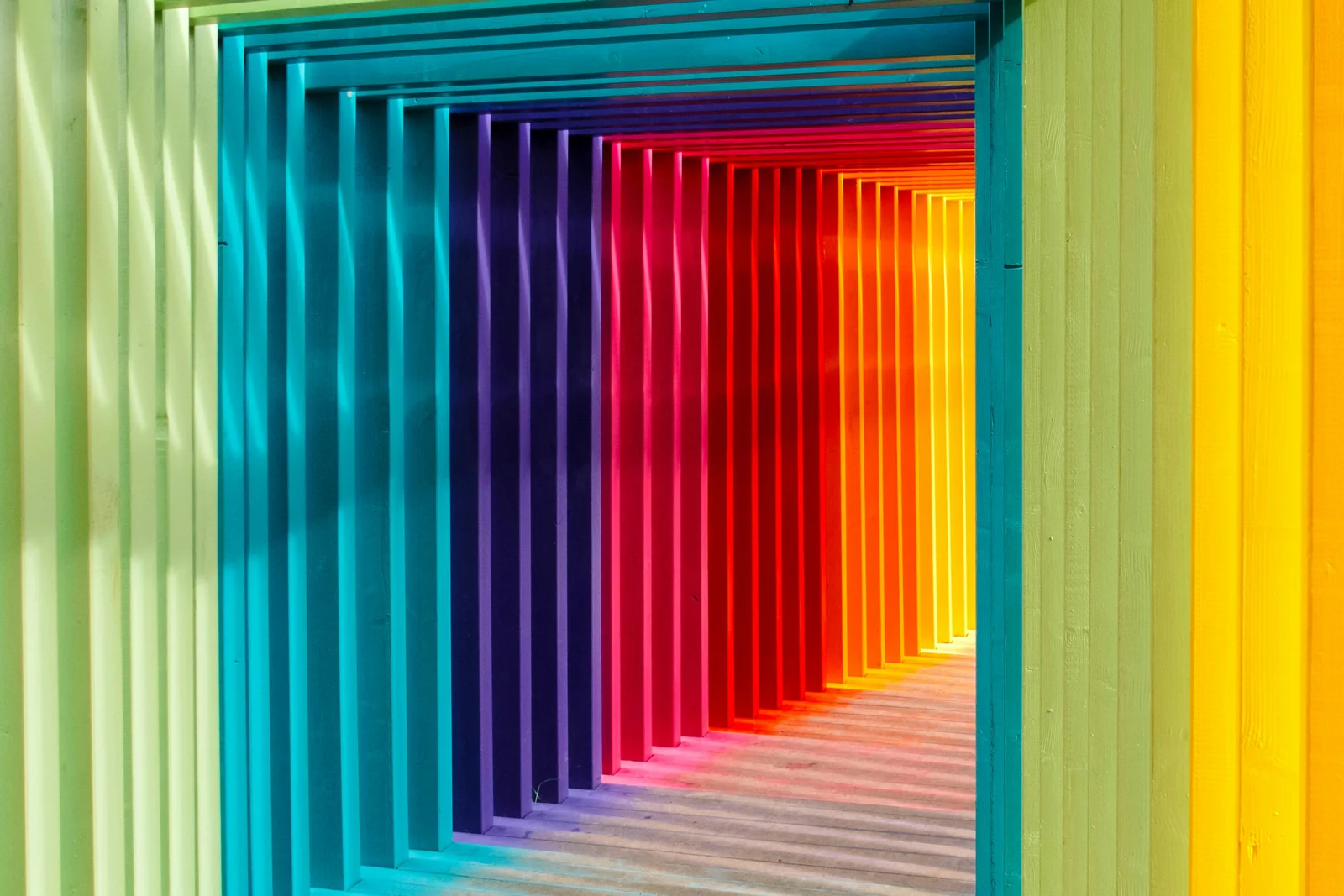
- Color and emotion: Warm tones like red, orange, and yellow are often associated with energy, warmth, and happiness. Cool tones like blue and green tend to promote calmness, focus, and relaxation.
- Color and memory: Studies have shown that using color to highlight information can boost memory retention. For example, when important content is presented in color (rather than black and white), it becomes more salient and memorable.
- Color and physical response: The color red, for instance, has been linked to increased heart rate and blood pressure, making us feel more alert and attentive.
What People Feel About Colors
Research has revealed that people commonly associate specific emotions with certain colors. Here are some findings from a color-emotion study:
- 🔴 Red – 68% associated with love
- 🟡 Yellow – 52% associated with joy
- ⚫ Black – 51% associated with sadness
- 💗 Pink – 50% associated with love
- 🟠 Orange – 44% associated with joy
- ⚪ White – 43% associated with relief
- 🟢 Green – 39% associated with contentment
- 🟤 Brown – 36% associated with disgust
- 🔵 Blue – 35% associated with relief
- 🟣 Purple – 25% associated with pleasure
Contrast Matters Too: Enhancing Memory and Visibility
It’s not just individual colors that matter — the combination of colors can also make a big difference. High-contrast color pairings are more likely to grab attention and improve the visibility of objects or text. This, in turn, helps with memory retention and information processing.
Think of a well-designed app or website: elements that stand out visually are often the ones you remember or interact with most.
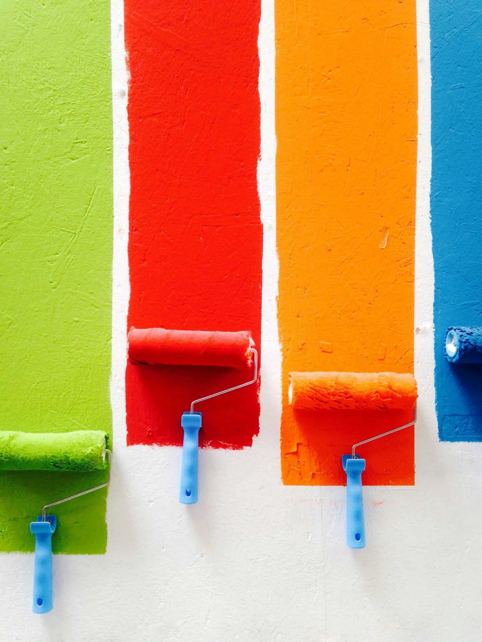
Why Color Choice Is Crucial in Design
Whether you're designing an app, website, ad, or presentation, the colors you choose are more than just aesthetic decisions. They directly influence how users feel, how well they retain information, and how they engage with your content.
So, the next time you’re picking colors for a project remember: color isn't just seen. It’s felt, processed, and remembered.
From Perception to Prediction: Turning Color Insights into Smarter UX
Color doesn’t just define aesthetics — it shapes how users feel while interacting with digital products. At Moveo One, we use cognitive analytics to measure how such sensory and emotional factors, including color, impact engagement, attention, and retention. By analyzing user responses and interaction data, Moveo One helps teams design interfaces that don’t just look good — they feel intuitive and emotionally aligned. In a world where every pixel can influence memory and mood, understanding color through data becomes a superpower for better UX.
Final Thought
Color is a subtle yet powerful force. When used thoughtfully, it can inform, inspire, and even influence behavior. So don’t just see the colors around you — understand and use them to your advantage.
- https://www.forbes.com/sites/princeghuman/2023/03/28/how-the-neuroscience-of-color-impacts-consumer-behavior/
- https://thedecisionlab.com/insights/society/how-colors-affect-the-way-we-feel
- https://journals.sagepub.com/doi/10.1177/0956797620948810
- https://pmc.ncbi.nlm.nih.gov/articles/PMC3743993/
Keep reading
More from the blog
Predicting the Impact of Product Changes Before You Ship — How We Built Moveo One's Behavioral Engine
Analytics tell you what happened. Moveo One's new behavioral engine tells you what will happen to your users when you ship a change — before a single real user touches it. Here's how we built it.
What Is Attention and Why Is It So Hard to Maintain Today?
Part Two: How the Brain Reacts to Monotone vs. Highlighted Stimuli
Highlighted stimuli activate the brain in powerful ways, boosting attention and sharpening focus, while monotone input pushes the mind toward idle mode. Understanding how the brain reacts to pronounced visual and auditory cues helps explain why some content captures us instantly — and how platforms like Moveo One use these patterns to predict user engagement.